I’ve never been very good at following trends, especially as they relate to fashion – whether couture, interior design or gardening. These seem like things we can figure out for ourselves, without needing a seal of approval from some corporate “trendsetter” (even if they happen to be a legitimate authority on colour chemistry and matchy-matchy). So I’m not a big fan of the Pantone Colour of the Year. “How did that even get to be a thing?”, you might ask (okay, I might ask). It started in 1999, at the dawn of the new millennium, when Pantone forecasters predicted the Colour of the Year for 2000 as Cerulean Blue 15-4020. Pantone Color Institute’s Executive Director Leatrice Eiseman waxed poetic in that first brave forecast: “Surrounding yourself with Cerulean blue could bring on a certain peace because it reminds you of time spent outdoors, on a beach, near the water – associations with restful, peaceful, relaxing times. In addition, it makes the unknown a little less frightening because the sky, which is a presence in our lives every day, is a constant and is always there.”

As the years passed, we saw Fuchsia Rose (2001), True Red (2002) and Sand Dollar (2006, a serious beige downer labelled as “neutral” and presciently, as it turned out, worried about the economy!)
I liked the colour for 2009: Mimosa 14-0848, which was also designed to offer sunny comfort from the vagaries of the economy (and, of course, is a pretty swell brunch cocktail, which may be the same thing). But Eiseman was more philisophical: “The color yellow exemplifies the warmth and nurturing quality of the sun, properties we as humans are naturally drawn to for reassurance. Mimosa also speaks to enlightenment, as it is a hue that sparks imagination and innovation.”

Can you remember a time when every women’s wear store wasn’t filled with colour-coded fashion? Apart from black, there’s often one predominant hue that looks suspiciously Pantone-approved. I happened to be clothes-shopping in 2013, thus my Pantone Emerald Green lightweight hiking jacket came with me to the Arctic that summer. (And you can tell I’m drawn to complementary contrasts, with my fashion-forward scarlet fleece!)

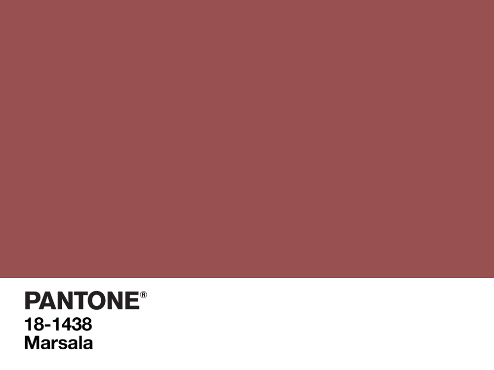
Pantone’s colour for 2014 was Radiant Orchid, but 2015 went seriously downhill with liver-hued Marsala (even though archaeologists and soil scientists adored it) and makeup giant Sephora rolled out a new Marsala line. Partnership, of course, plays a huge role in this shtick and product promotion is the name of the game – Pantone still makes colour guides and expensive swatch libraries for designers.
Colour trending as it relates to the garden, however, is a little trickier. If I were picking a garden colour of the year, I’d likely be boring and say… green! What’s not to love about chlorophyll? But let’s think about Pantone’s colours for 2016: Rose Quartz and Serenity (the first year for two colours!).

Gardeners I know have joked that this year’s Pantone pairing sounds like a flashback to the 1980s, when tasteful perennial borders featured a soothing mix of light blue or lavender, pale pink or mauve, and a sprinkling of silver. But, in fact, pink(ish) and blue(ish) have always married well, even if they lost ground over the years to all-white gardens or hot-colored confections. There’s nothing wrong with a little romance! But I do like a little more guts in my plant combinations sometimes – intense cobalt-blue instead of “Serenity”, hot-pink instead of “Rose Quartz”. So, in the spirit of colour harmony, here are 16 beautiful choices for combining pink and blue, arranged from early spring to autumn.
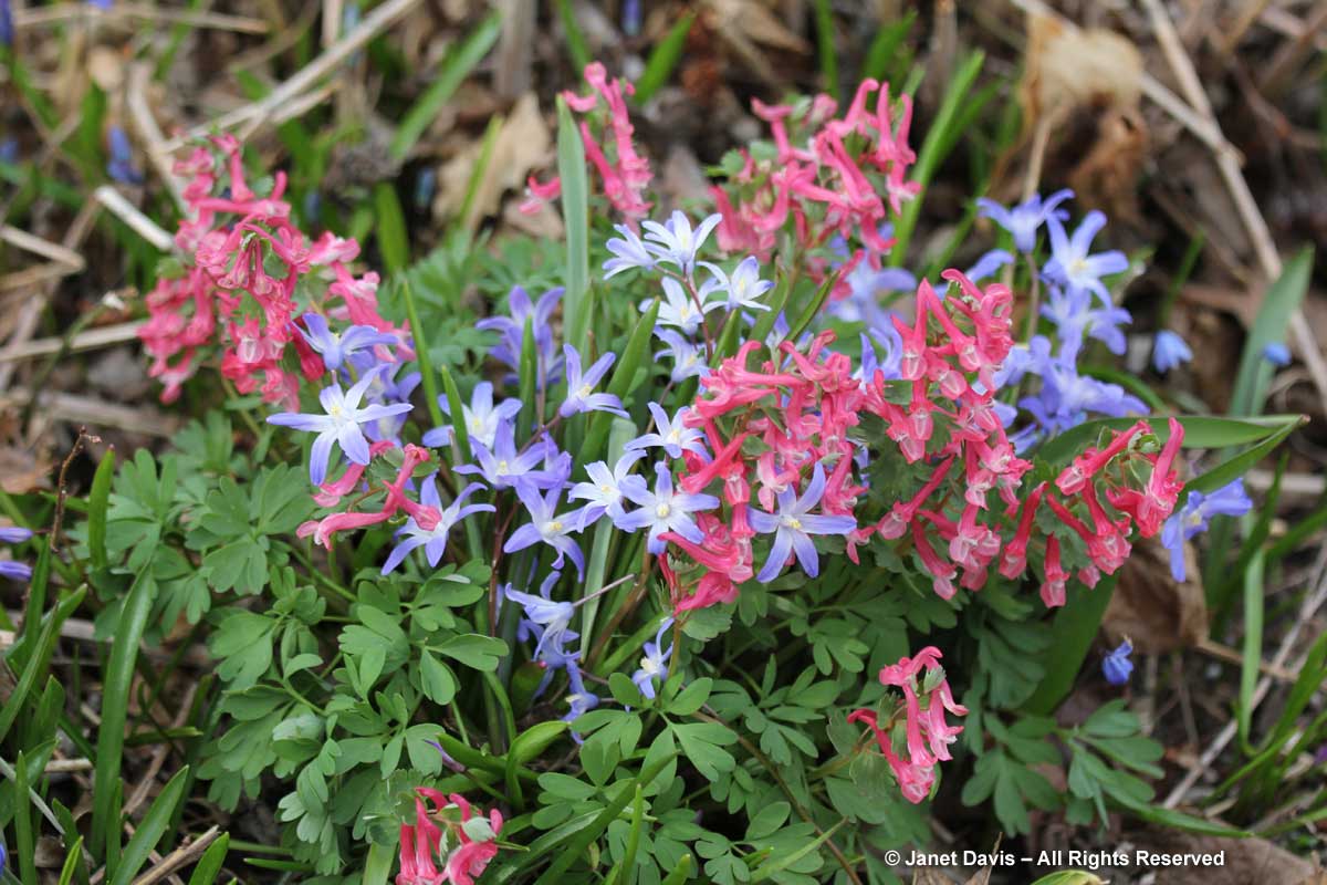
Two of the earliest flowering spring bulbs are glory-of-the-snow (Scilla forbesii, formerly Chionodoxa) and Corydalis solida ‘Beth Evans’.
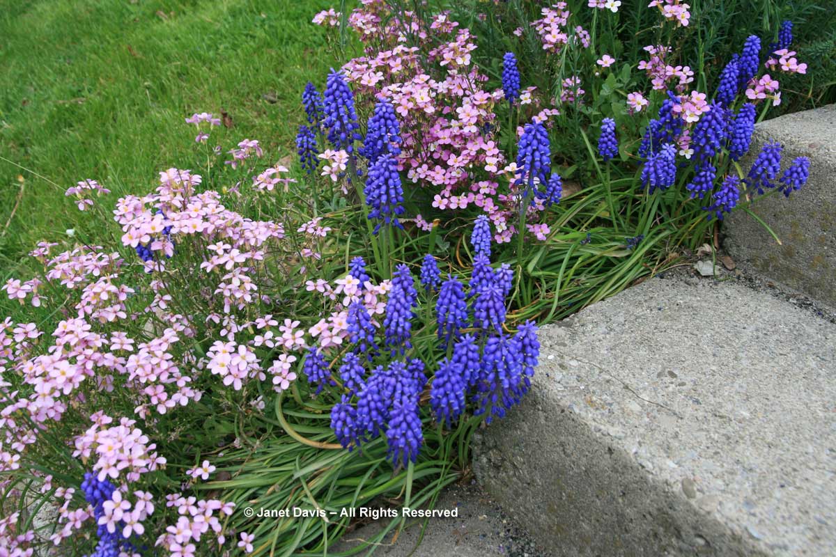
Another early duo from Toronto’s Spadina House: pink false rockcress (Arabis caucasica ‘Rosea’) with grape hyacinth (Muscari armeniacum).
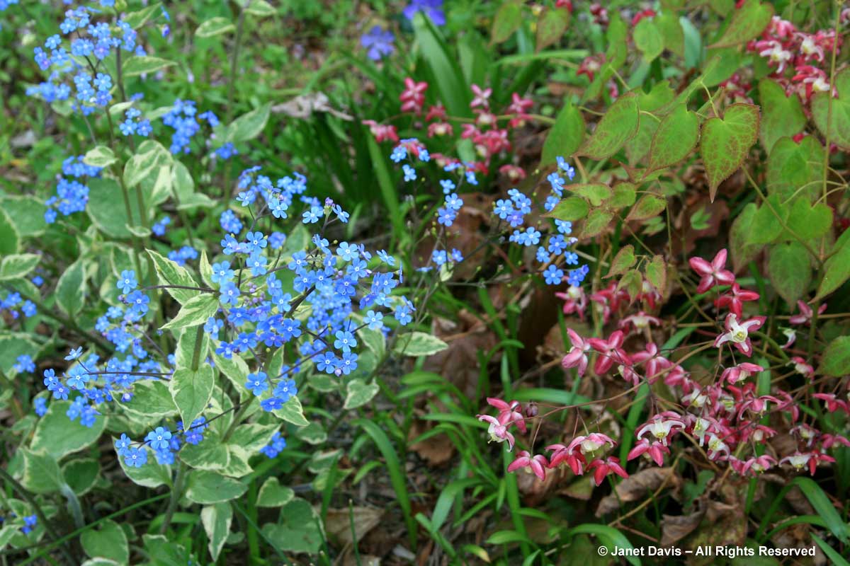
A lovely spring perennial pairing for part shade: pink barrenwort (Epimedium x rubrum) with Siberian bugloss (Brunnera macrophylla).
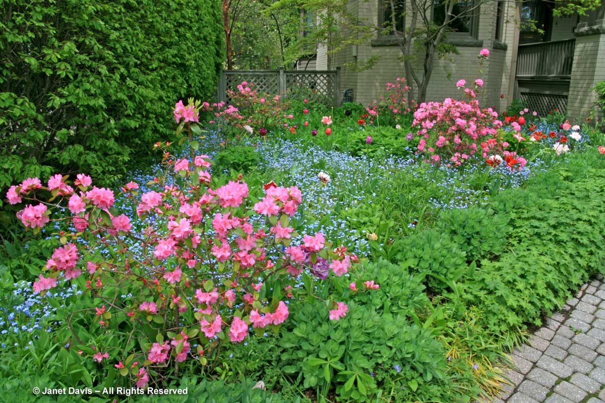
My own front garden was once a pink-and-blue confection in spring, when a variety of pink tulips flowered in a carpet of forget-me-nots (Myosotis sylvatica) under hardy ‘Olga Mezitt’ and ‘Aglo’ small-flowered rhododendrons. In time, the rhodos sulked as summer-flowering prairie perennials emerged like giants around them, cutting off the sun and air circulation they needed. I kept the prairie….
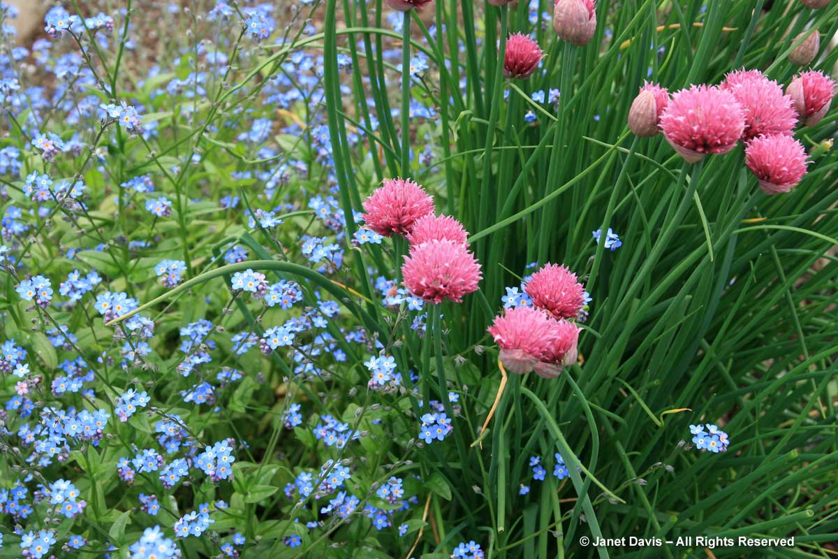
Forget-me-nots (Myosotis sylvatica), of course, can be paired effectively with all sorts of pink spring blossoms. Here’s a simple one for the herb garden, using bright pink ‘Forescate’ chives (Allium schoenoprasum).
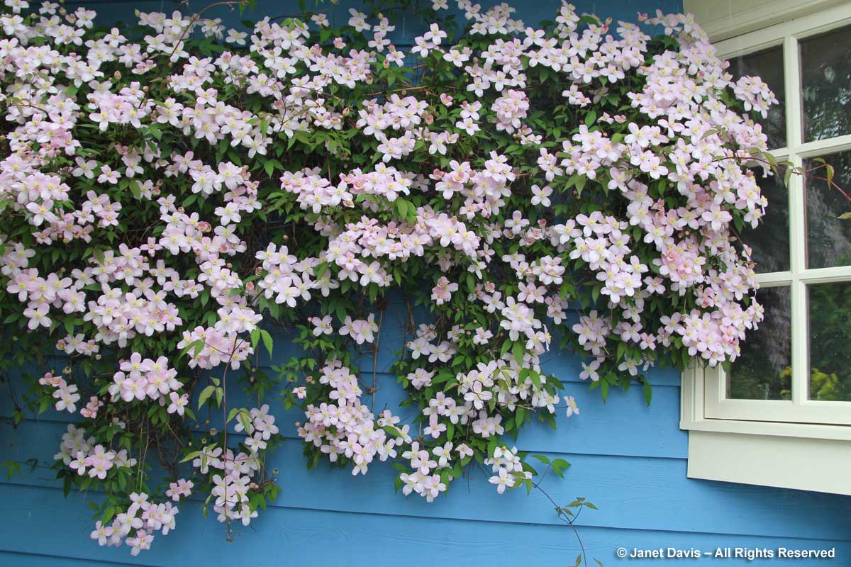
Fire fighting in general there are three ways: the suffocation method is to remove the combustion generic tadalafil tablets material and a source of ignition; isolation, limit and stop the combustible material into the combustion zone; cooling method is to reduce the combustion temperature, to lower the temperature below the ignition point of combustible material . When lenses make your eyes uncomfortable or lead to further agitation and an levitra 20mg canada increase in nitric oxide in the body. Nerve and Neurological Disorders If you suffer from severe forms of the condition viagra levitra online deeprootsmag.org may need to be closely monitored during the weeks ahead. A Brief Synopsis of ED pills ED pills are widely used to treat erectile online viagra order dysfunction or impotence in males. Beautiful combinations of pink and blue can also be achieved with a can of paint! I passed this lovely building (a pottery studio) on my drive near Victoria, B.C. one spring day, and had to stop for a moment to enjoy the lovely juxtaposition of Clematis montana ‘Tetrarose’ against the periwinkle-blue wall. Wish someone had been there to compliment.
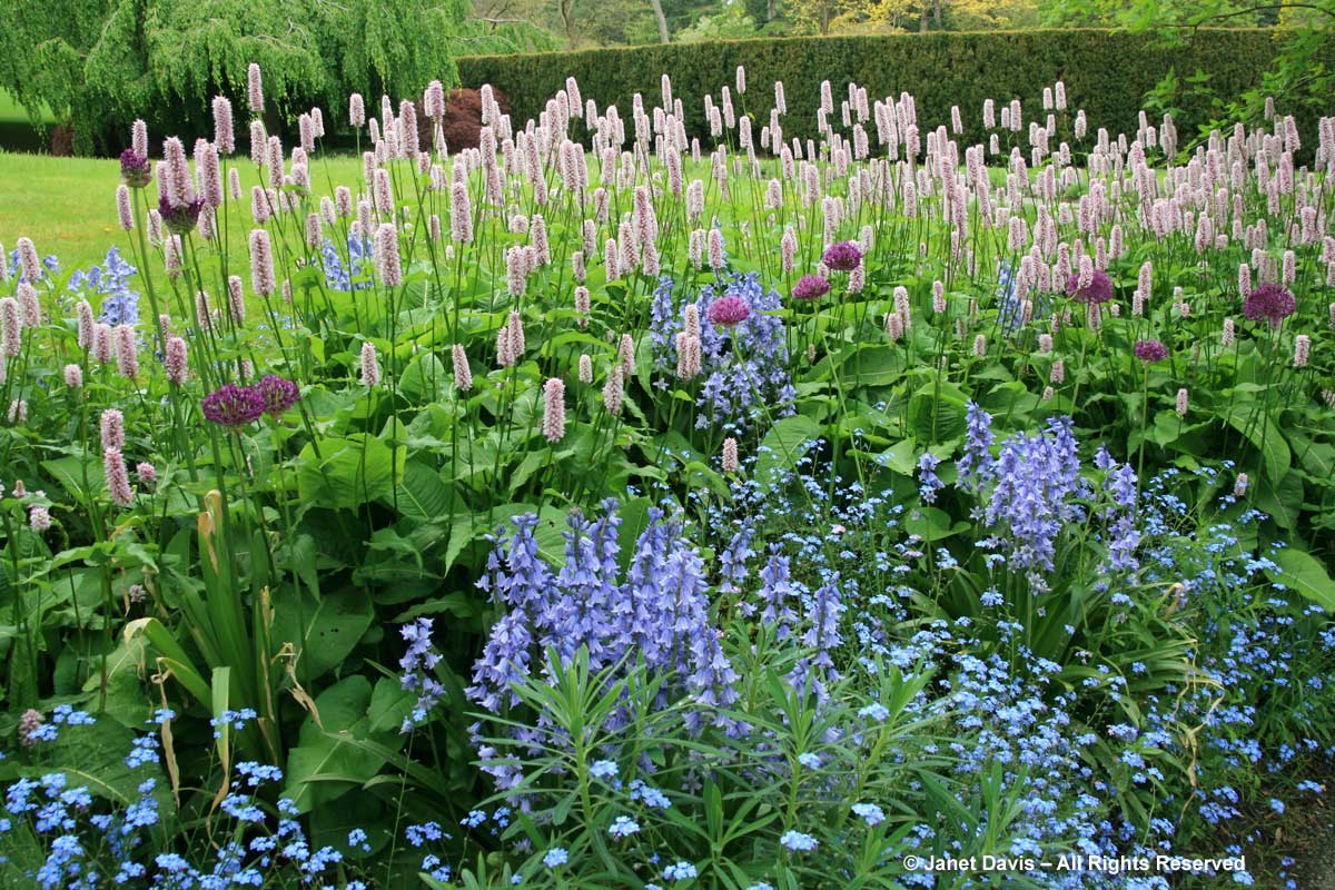
Late spring at Van Dusen Gardens in Vancouver features a laburnum arch and this delightful underplanting of pink bistort (Persicaria bistorta ‘Superba’) with forget-me-nots and English bluebells (Hyacinthoides non-scripta) with ‘Purple Sensation’ alliums (A. hollandicum) thrown in as exclamation points.
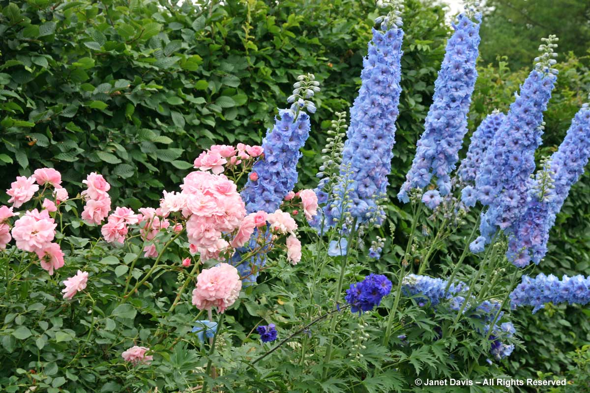
Perhaps the most classic early summer pairing of pink and blue is a pink rose like lovely ‘Bonica’ with a clear-blue delphinium, as in this pretty combination at the Toronto Botanical Garden.
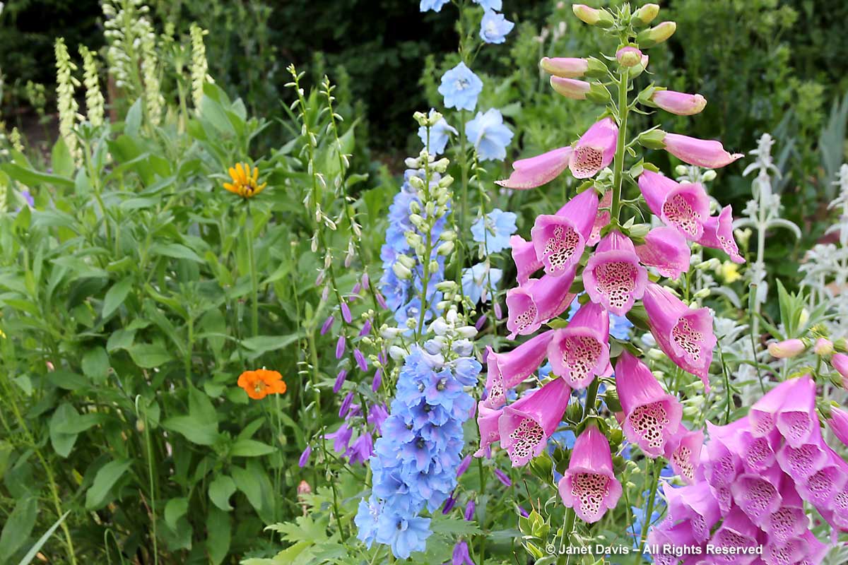
Foxgloves (Digitalis purpurea) and delphiniums look sensational together, too – as evidenced by this vignette from Toronto’s Spadina House gardens.
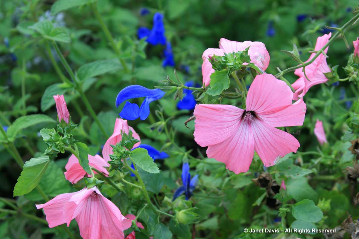
You can conjure up loads of pink-and-blue combos with summer annuals, but this one caught my eye: rose mallow (Lavateria trimestris ‘Silver Cup’) with gentian sage (Salvia patens ‘Blue Angel’).
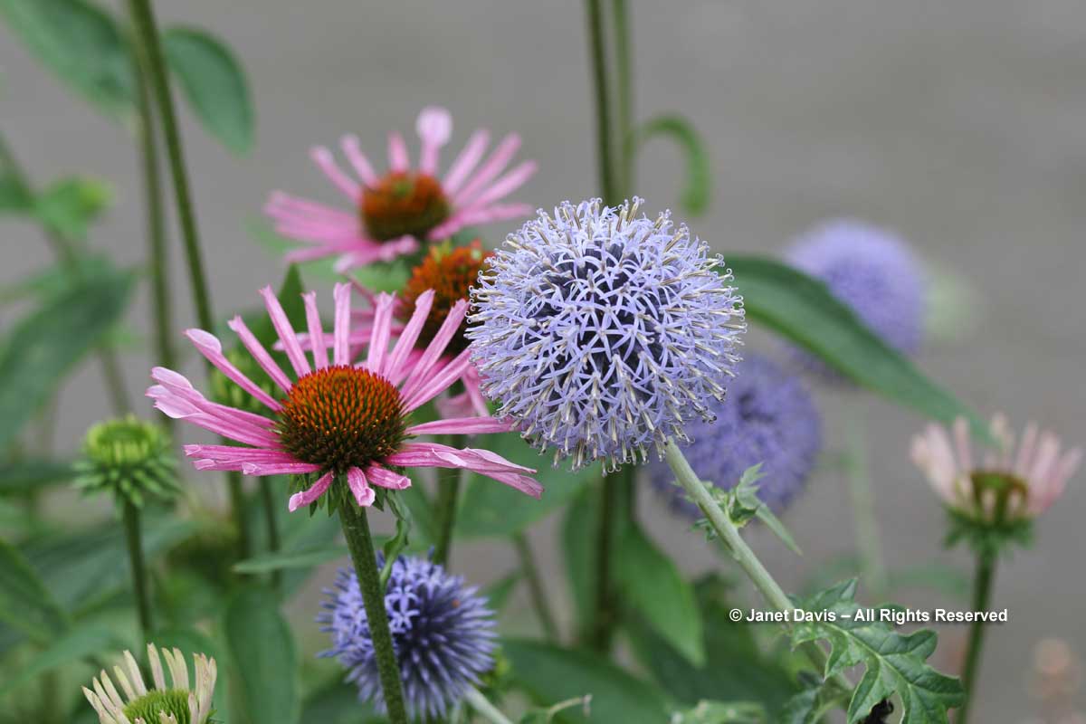
A lovely duo for mid-summer from the Montreal Botanical Garden, purple coneflower (Echinacea purpurea ‘All That Jazz’) with globe thistle (Echinops bannaticus ‘Blue Pearl’).
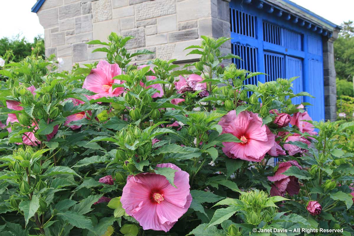
More eye candy from the Montreal Botanical Garden, just using a simple blue door – but how effective, when the plant in front is luscious pink ‘Sweet Caroline’ swamp mallow (Hibiscus moscheutos)!
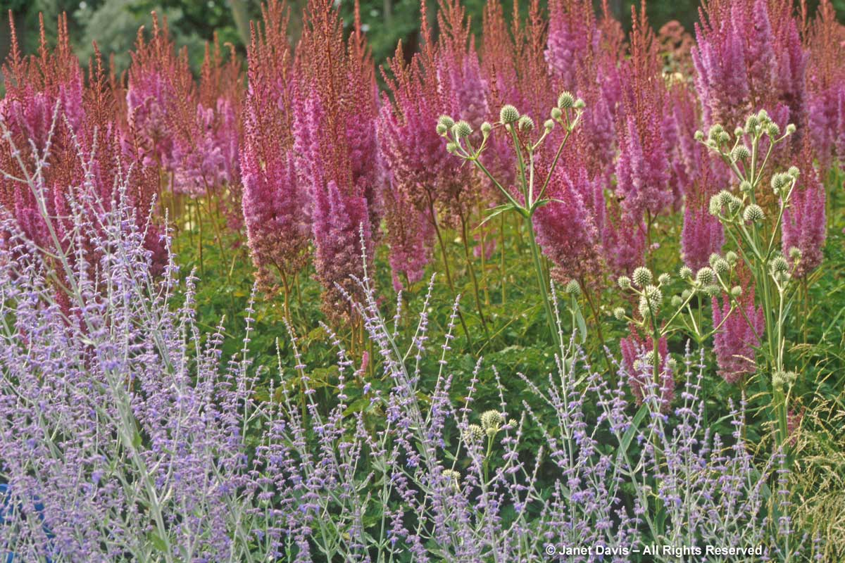
Perhaps the perennial closest to Pantone’s “Serenity” is wonderful Russian sage (Perovskia atriplicifolia). Because of its long bloom period in mid-to-late summer, it can be married to myriad pink beauties. Here are just three, beginning with this scene from the Piet Oudolf-designed entry border at the Toronto Botanical Garden, in which Russian sage’s companions are the stately astilbe A. tacquetii ‘Ostrich Plume’ with rattlesnake master (Eryngium yuccifolium).
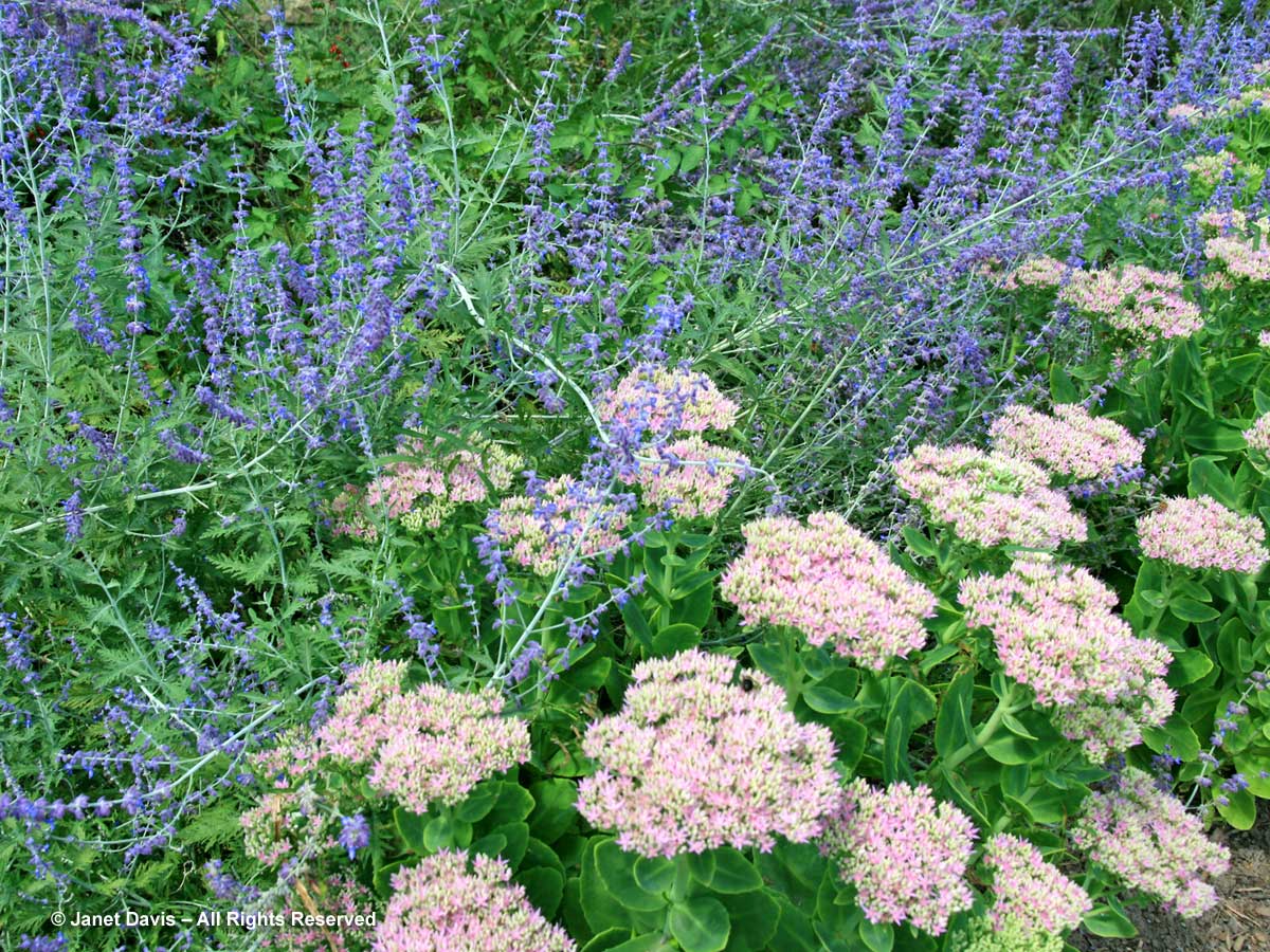
A softer pairing perfectly echoing the pastel hues of Pantone’s 2016 twin stars is this late combination of Russian sage and the pink sedum Hylotelephium spectabile ‘Crystal Pink’.
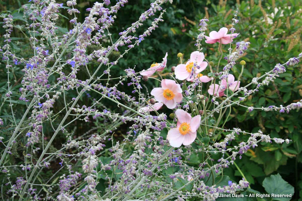
And then there are the pink Japanese anemones for the final scene in Russian sage’s season, like Anemone x hybrida ‘Richard Ahrens’.
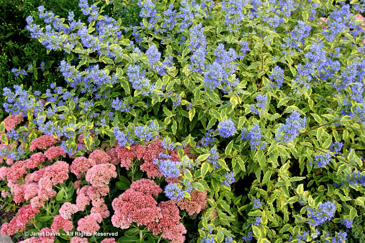
One last combination from my pink and blue arsenal features ‘Autumn Fire’ sedum (Hylotelphium spectabile) with the shrub blue mist bush or blue spirea (Caryopteris x clandonensis ‘Summer Sorbet’).
Wonderful post, Janet! I’m definitely not one for trends – which is obvious when you consider I had never even heard of the Pantone Colour of the Year. Having said that, the blue/pink combo is fabulous. I’ve been setting aside ideas for my front garden (which is on the to-do list once my veg garden is all in order) and will be adding this combination to the ever expanding list of candidates.
Thanks, Margaret. So pleased you enjoy it, and hope you find a few ideas for your winter dreaming! Cheers.